o x y g e n 8
Associated with Punch
Project Task
Anyone who’s been in the HVAC business can tell you - it is far from being ‘sexy’ How do you make air filtration look good? that’s exactly the problem Oxygen8 approached us with. Well, that, and the arduous challenge of putting together thousands of data points from an array of devices dedicated to indoor air quality. Oxygen8's goal is to transform indoor environments into comfortable, sustainable spaces. This project brought unique challenges to the table:
But here's where it got interesting:
1 . A Complex Puzzle:
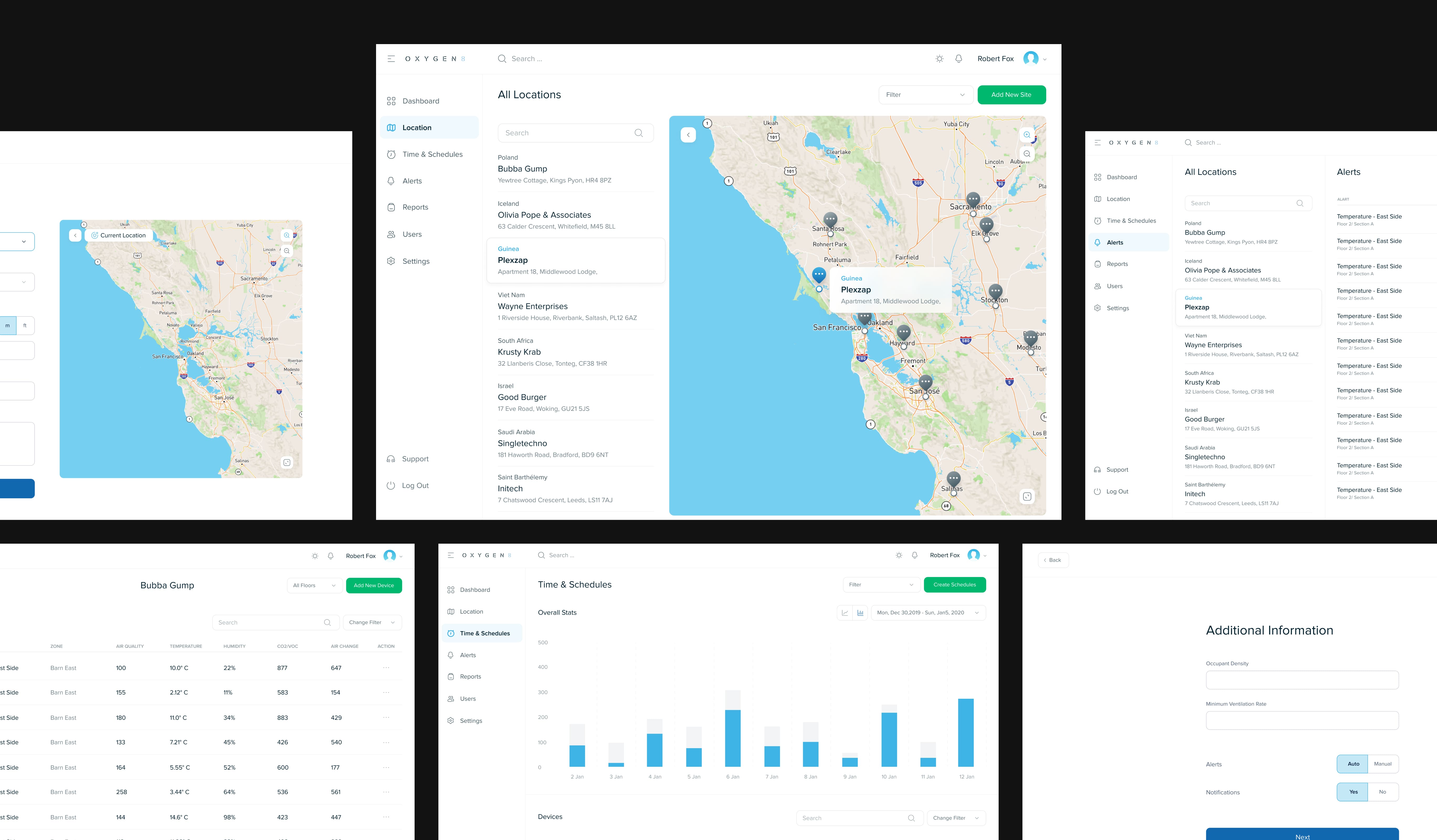
Oxygen8's magic involves juggling various sensors - heat, water, occupancy, you name it. The challenge was to take all this data and serve it up in a format that's not just digestible but actionable.
2 . User-Centric Design:
Picture this: building managers, facility maintenance pros, and eco-warriors - all under one virtual roof. Crafting an interface that speaks their unique language would be no small feat.
3 . Scalability:
Oxygen8 had its sights set on managing the environmental scene for entire buildings. That's a tall order. The UI/UX had to stretch without breaking, whether it's a skyscraper or a cozy little office.
4 . Interconnectivity:
Oxygen8's grand vision involved connecting office branches worldwide, and centralizing control over indoor conditions. Smooth communication across the globe? Now, that's a challenge.
The Solution:
To conquer these challenges and whip up a user-friendly, scalable, and interconnected solution, we unleashed a slew of strategies:
APPROACH
1 . User Research and Personas:
We took a deep dive into the user's worlds to understand their needs and pain points. Building managers, maintenance maestros, and green champions - all of them got out attention. We knew these would be the core users of the platform, and if it didn’t cater to them it really wouldn’t work. Personas became our best friends. We tailored the design to each group's unique desires.
2 . Intuitive Dashboard Design:
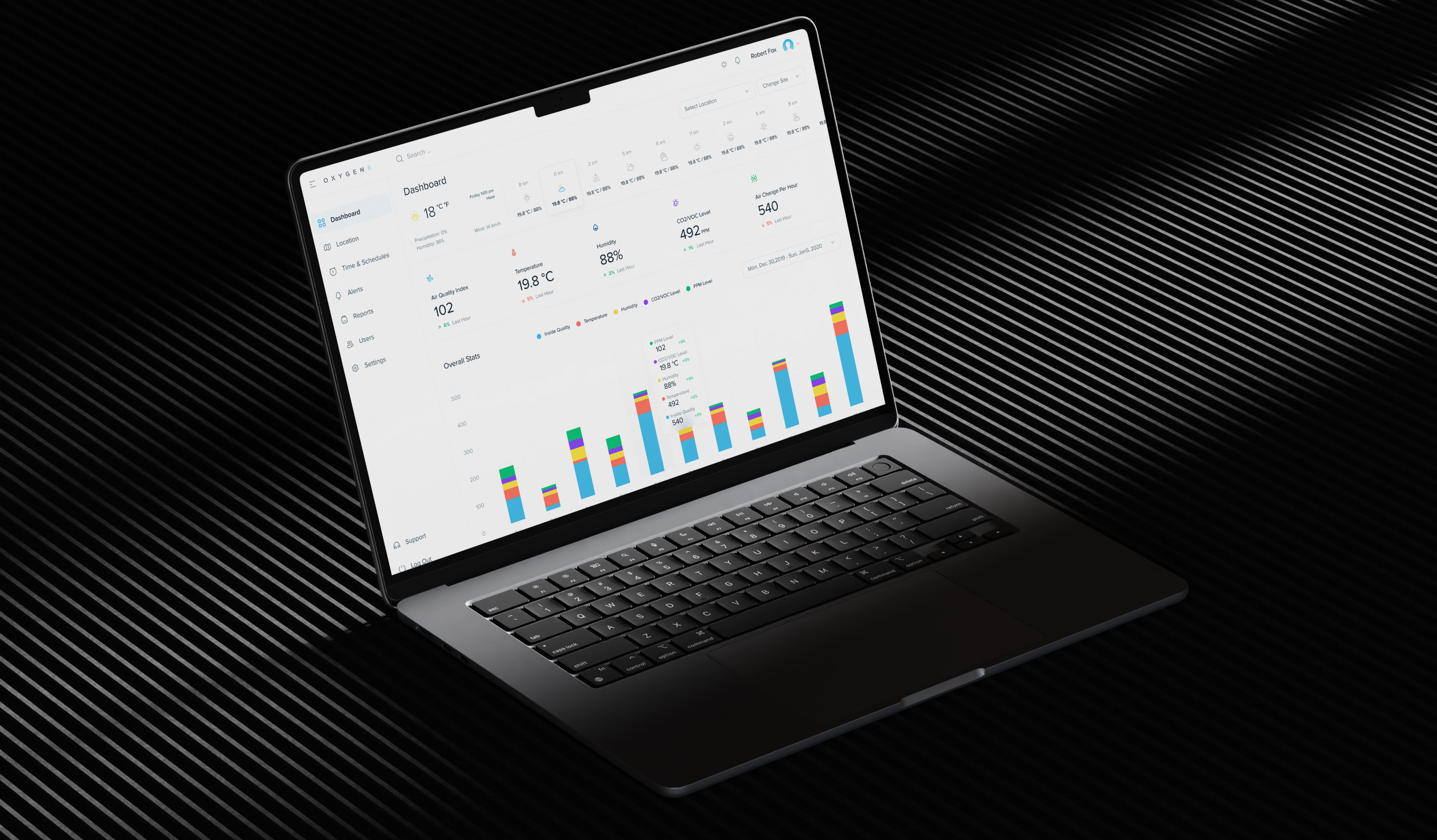
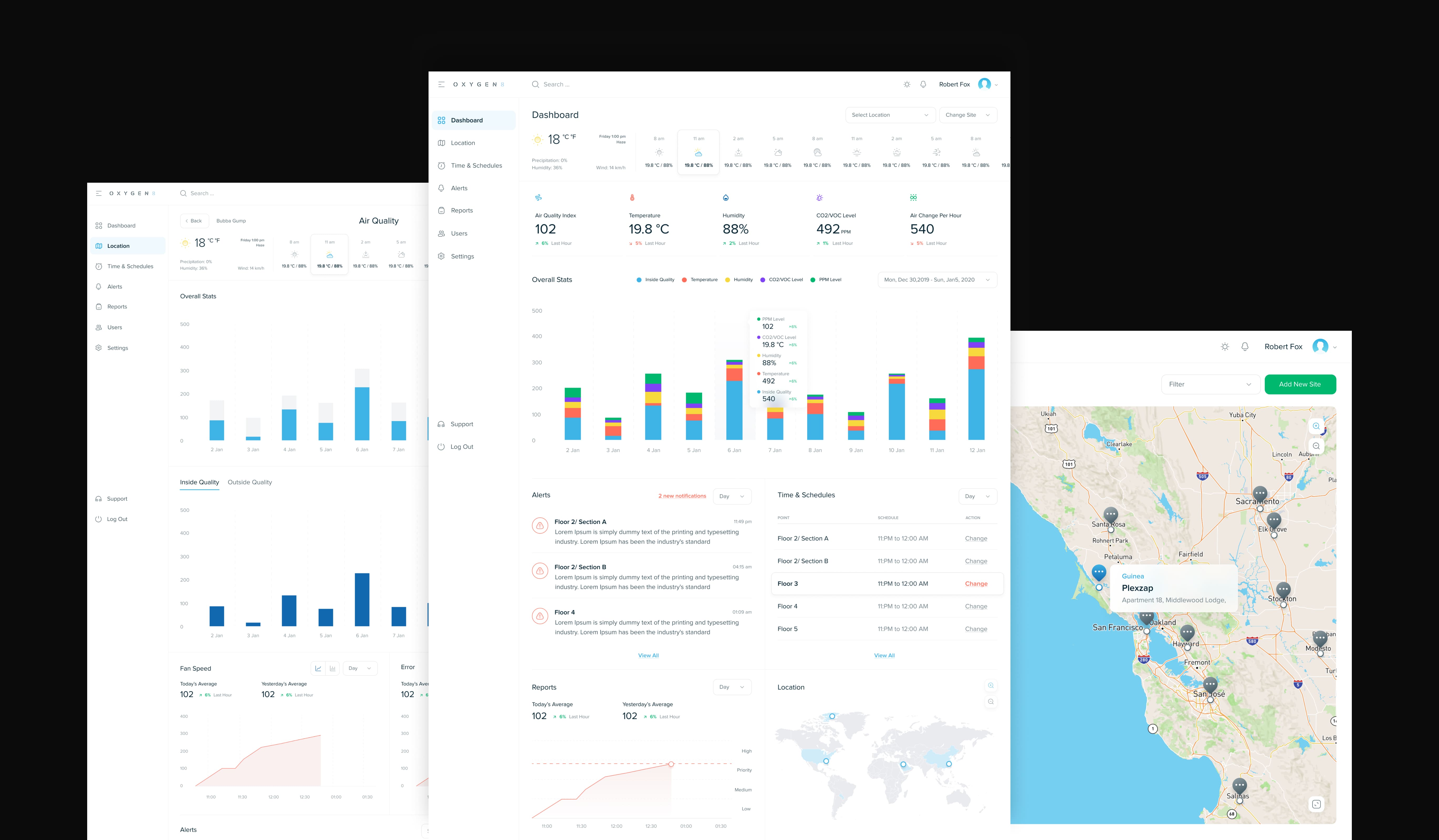
Complexity became simplicity with an intuitive dashboard. Sensor data, previously a tangled mess, now flowed gracefully. Visual magic came to our rescue - charts, graphs, and visualizations made environmental data a piece of cake. The goals wasn’t just to show the data but show it in a way that just made sense. This involved reviewing how data had been collected manually, and translating that into an digital experience.
3 . Sensors for the Future:
Initially, Oxygen8 had just the one sensor and model(the integration with Daikin VRV heat-pump) that would send the data via a complex network of wired and wireless tech. The dashboard was supposed to be built around this main sensor that would collect all the data points. But when a new sensor came into the mix, the game was on. We knew the entire system had to be built to scale - and the design reflected this. Tight collaboration with the development squad was our secret sauce. The architecture was ready to flex its muscles, whether it's a skyscraper or a cozy corner office.
4 . Multi-Location Integration:
One control center to rule them all? Managing offices worldwide from one spot? Check. Oxygen8’s goal was to create a connected digital sphere that would allow for centralized environmental control. Ensuring smooth communication between different locations was a critical challenge.
5 . Iterative Testing and Feedback:
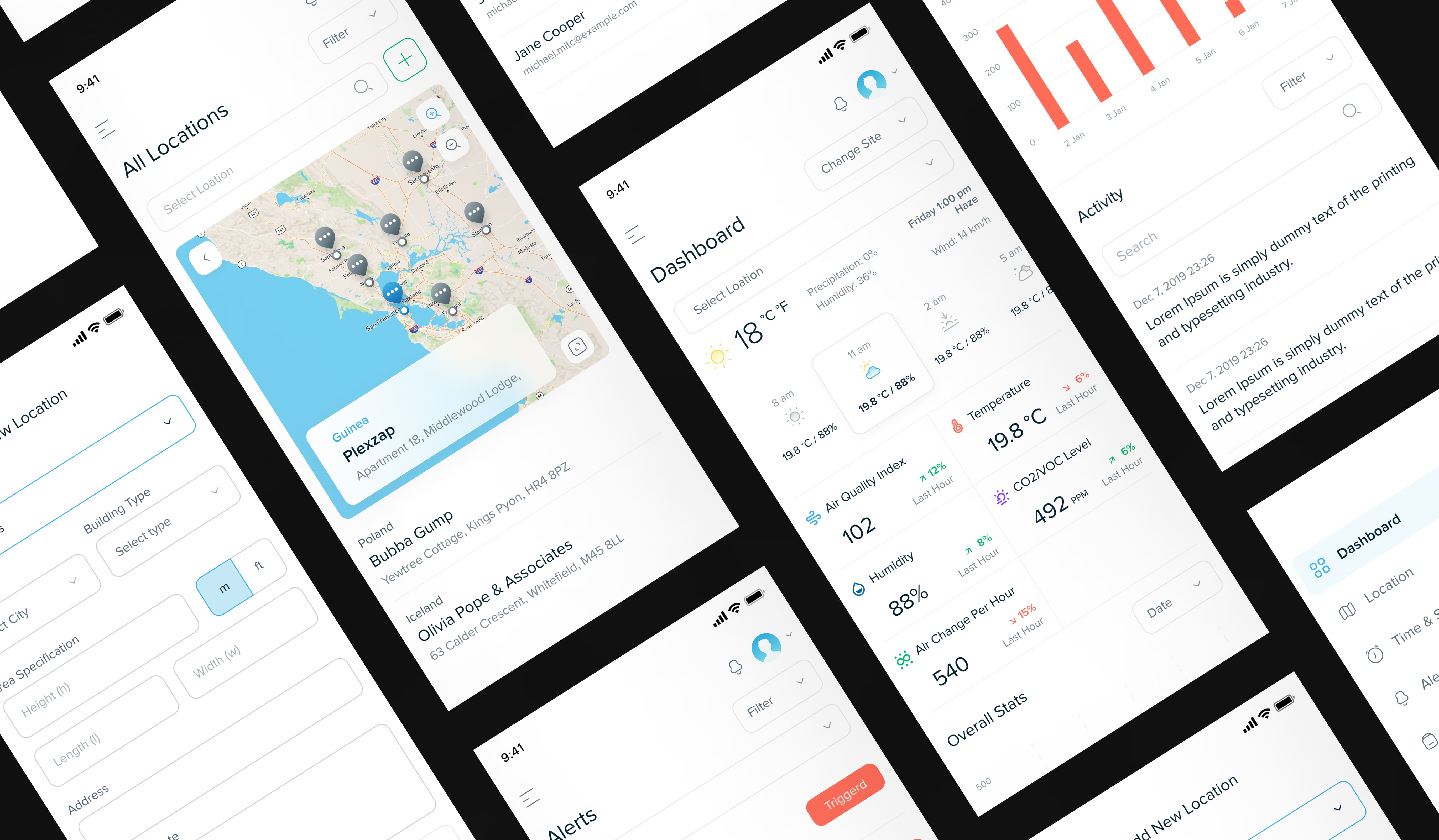
Regular rendezvous with users meant we were always in the know. Their feedback was the North Star. What it meant was a true sense of direction at all times. With their insights, we kept fine-tuning the design and functionality. With these strategies, we birthed a web-responsive application that aligned perfectly with Oxygen8's vision. It's the answer to smarter indoor air quality and energy efficiency. User-centric design, scalability, and worldwide office harmony - all wrapped up in one nifty package. Oxygen8's dream of sustainable living, working, and playing just got a stylish boost.
Results
$4M Dollar Seed Funding Secured
2+ High-level Sensors supported
Integration with Distech Hardwareoc
