r e d c l o u d
Associated with Punch
Project Task
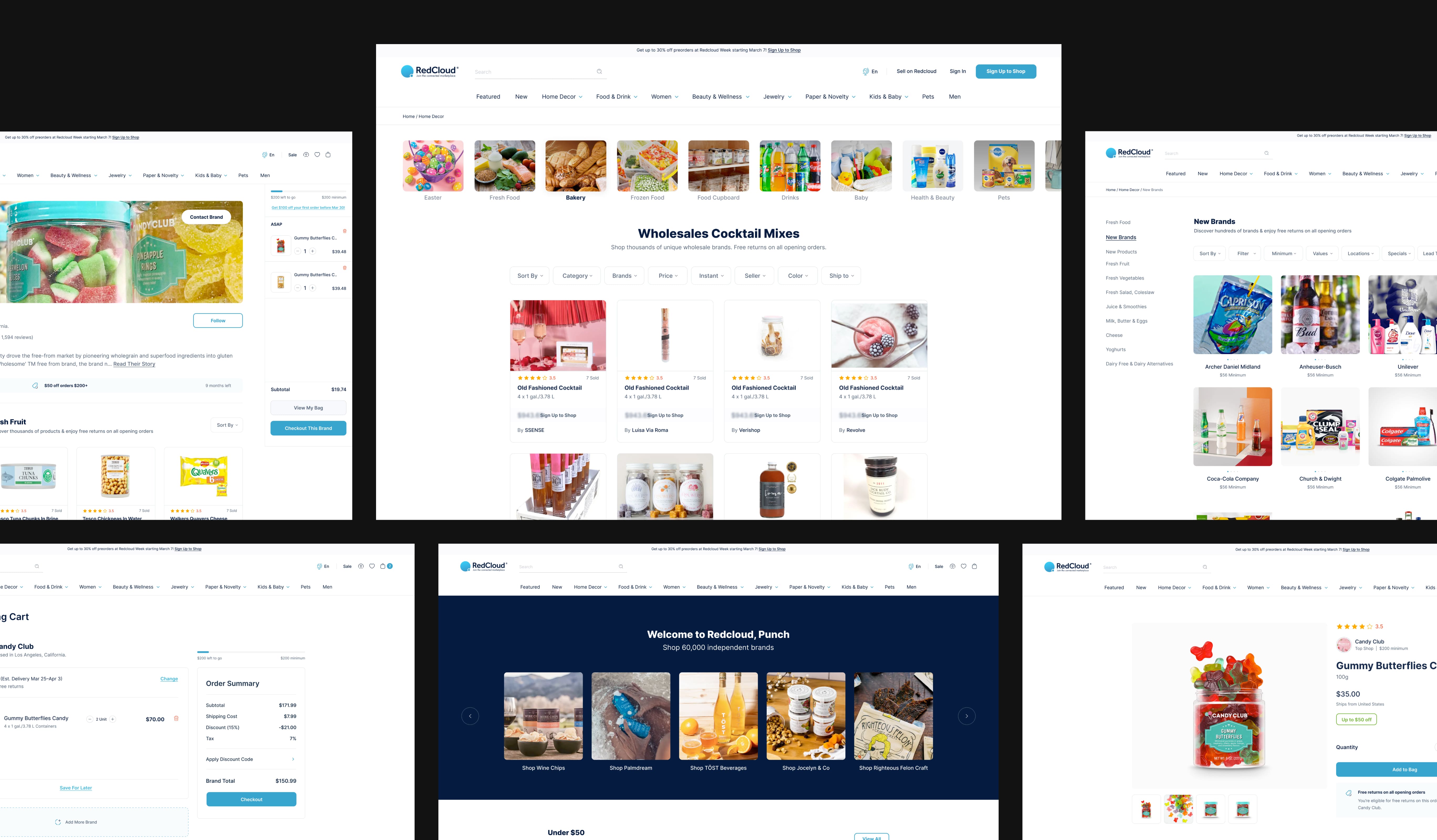
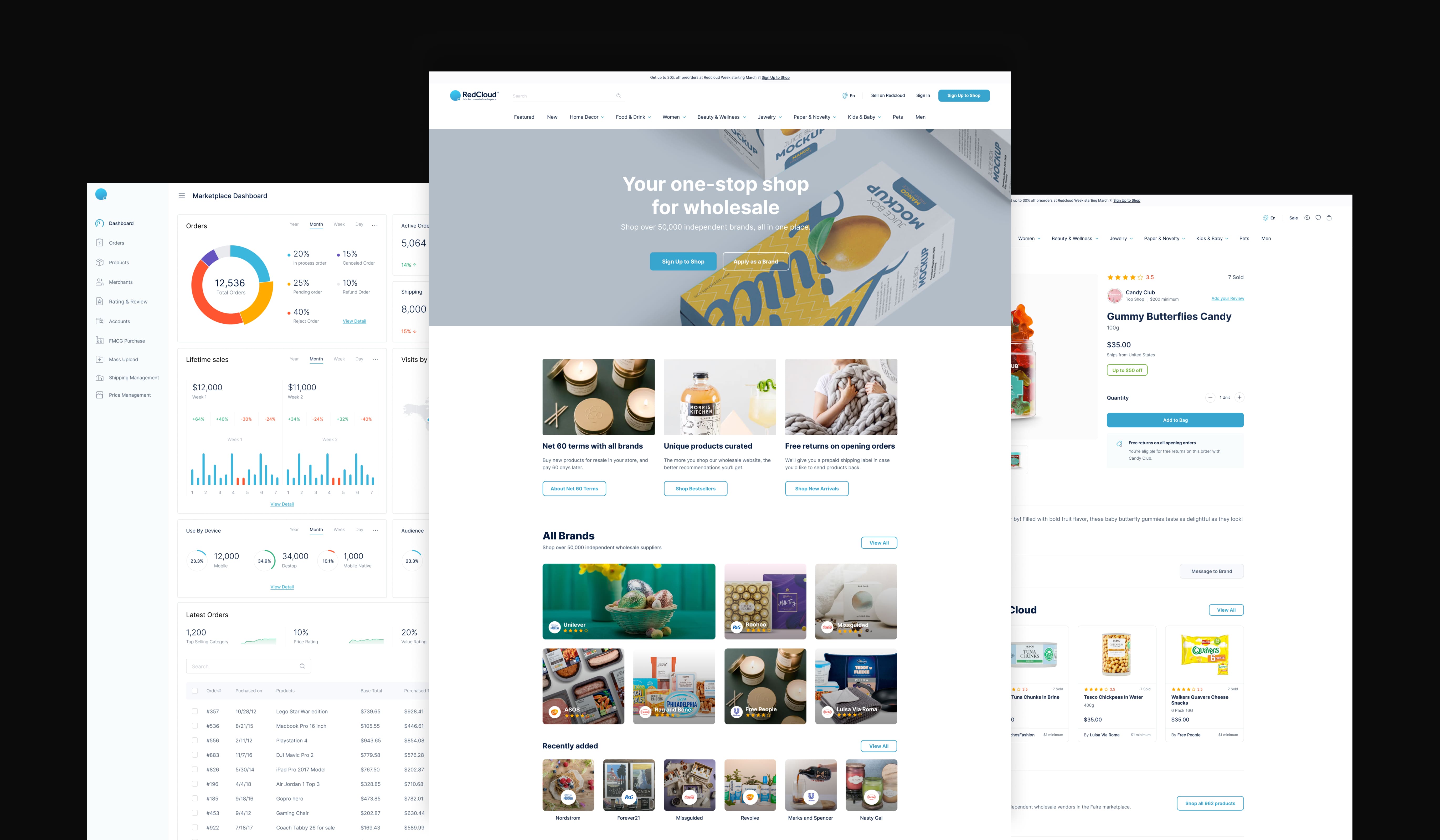
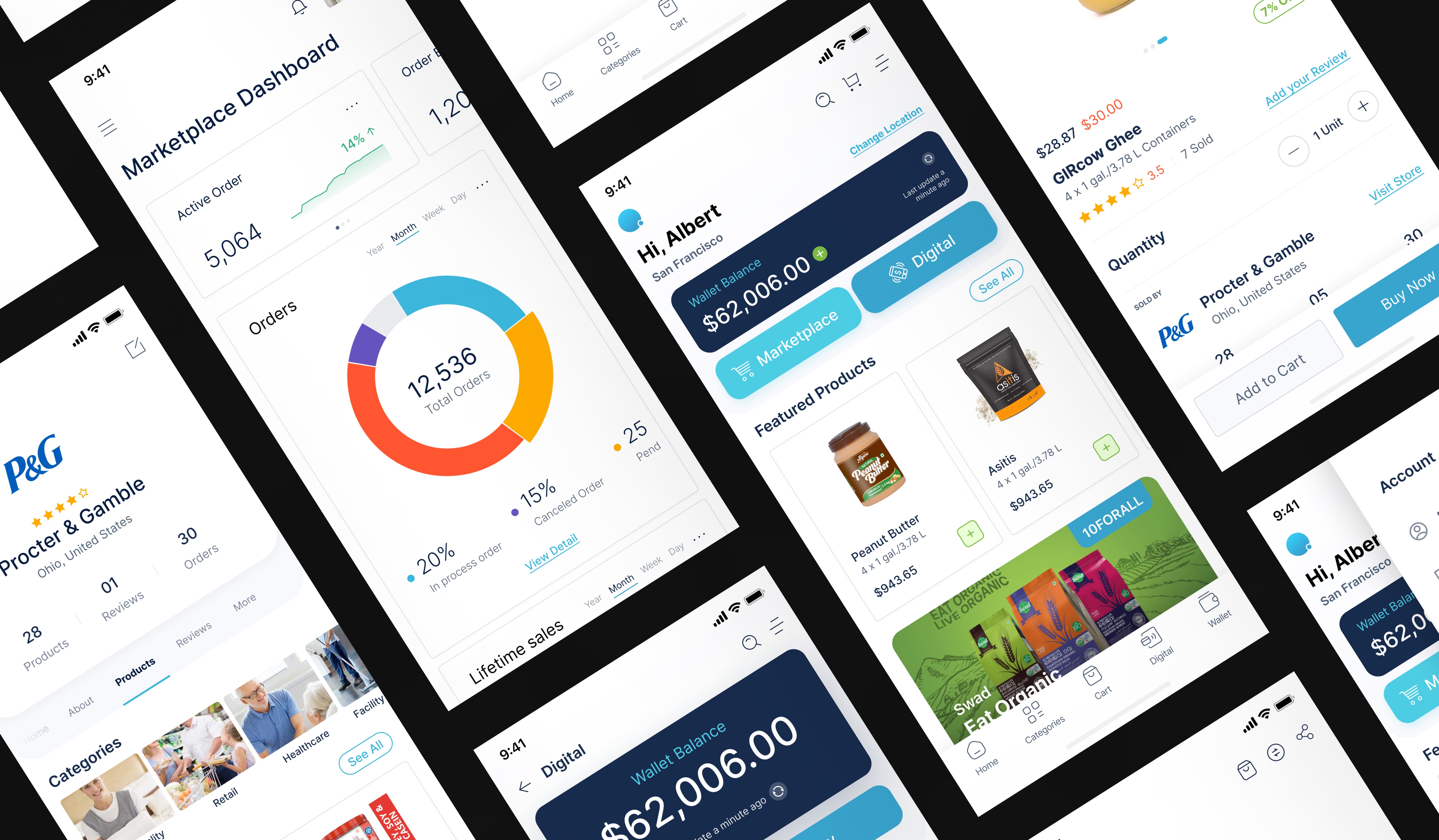
RedCloud, a standout in the tech world, set its sights on a game-changing Open Commerce platform. This platform was destined to unite brands, distributors, and merchants on a global scale. As the design head, our mission was clear: craft a user interface (UI) and user experience (UX) that would sing to distributors, retailers, and customers alike.
But here's where it got interesting:
1 . A Complex Puzzle:
Connecting the dots between different players in commerce was like solving a puzzle with pieces of all shapes and sizes. It required a deep understanding of how all the moving parts of the supply chain worked - for multiple global markers. The unique needs, workflows, and interactions. Navigating these diverse needs, workflows, and interactions while crafting a user-friendly interface? Now that's a challenge.
2 . Setting up for Scalability:
RedCloud's Open Commerce platform was designed to serve a global market - and multiple sectors of the economy. Suppliers, Distributors, and FMCGs. The initial plan was just to serve the West African Markets, namely, Nigeria but it quickly became apparent that it would be a shame if the opportunity in South Africa was missed out on as well. This impacted the user experience of the product - with intricacies for each audience. For example - the Nigerian market seldom used e-mail addresses, so a mobile phone option had to be implemented. Ensuring the UI/UX could scale effectively to accommodate increasing user volumes while maintaining performance and responsiveness was a critical challenge.
3 . Consistency:
Picture this: distributor dashboard, retailer app, website, and mobile customer app. Each had to speak RedCloud's language while making users feel like they were the stars of the show. Consistency, yet tailored. Quite the tightrope walk. We knew this was a product that would cross boundaries, continents, languages, and cultures, and this meant a lot of things might get lost in translation. Not on our watch.

Tackling the Challenge:
To address the challenges outlined above, we developed a comprehensive project solution that focused on simplicity, scalability, and consistency throughout the design process:
APPROACH
1 . User-Centric Approach:
We kicked things off with some heavy-duty user research. Distributors, retailers, customers – we talked to them all. We started off in West Africa, understanding the gaps in the current analog system and nuances that the system required. We quickly understood that with the type of market, RedCloud was targeting - an ‘open-bazaar’ approach where everything was connected, and everyone sort of knew each others name was vital in the success of this approacach. Nuances like the aforementioned e-mail usage were taken into account of the design. The insights we gathered? Pure gold. They led the way to designs that felt like a glove for their unique needs.
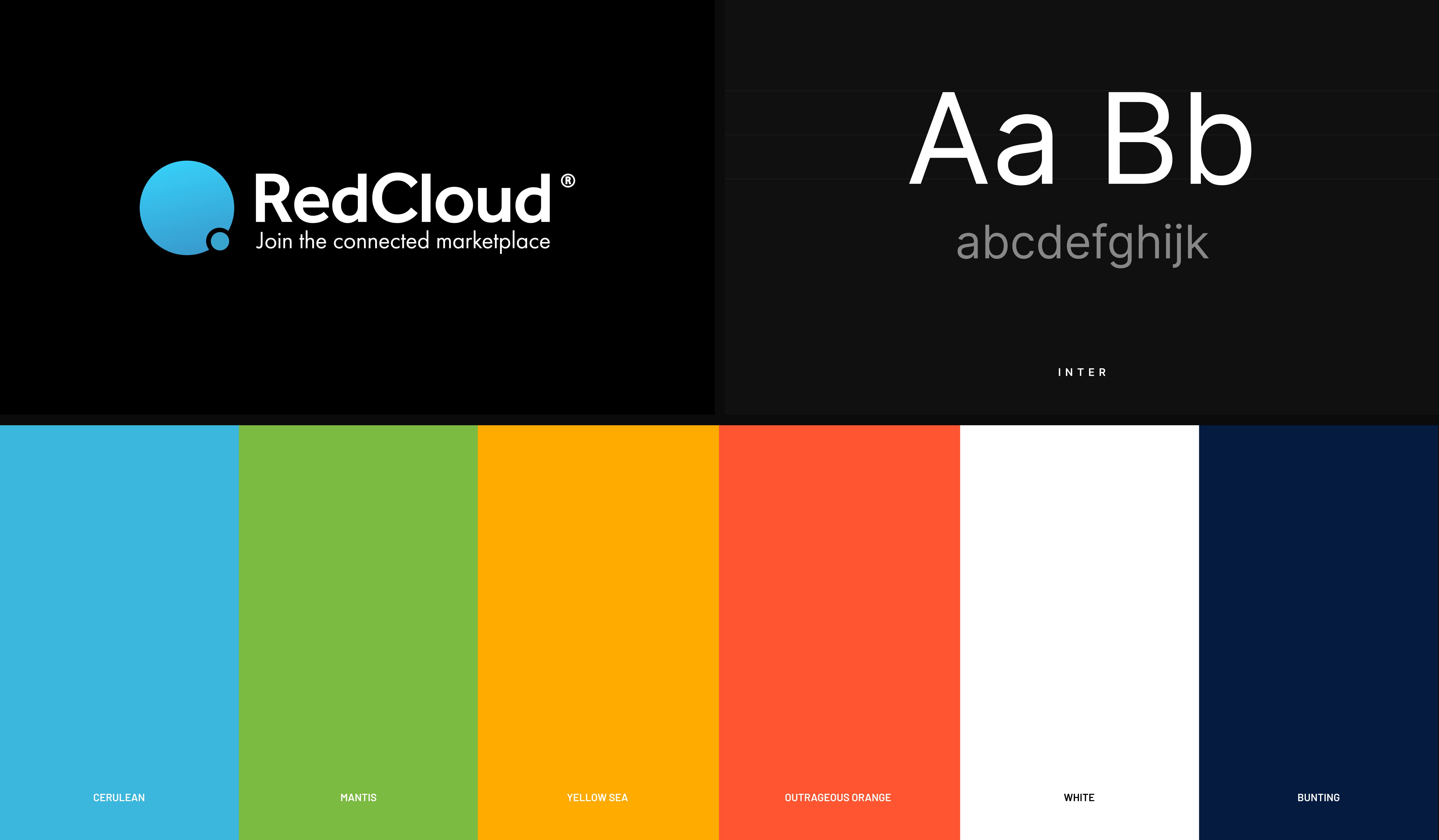
2 . Design System:
To ensure consistency across different interfaces, we created a design system that defined standardized UI components, typography, color palette, and interaction patterns. This design system acted as a style guide for the project, ensuring a cohesive user experience and reinforcing RedCloud's brand identity. The elements had to work within the established design sense - not around them. This now legendary design bible for RedCloud - which is your regular brand book, just dialed up all the way to 11, had to work across borders, continents, languages and cultures, and we couldn’t afford anything getting lost in translation.
3 . Iterative Design Process:
The journey was an iterative one, with regular check-ins with the stakeholders. Their feedback became the magic wand, polishing and perfecting UI/UX until they shone. This smooth flow also saved time and dollars. It was never about building out the perfect design in one-go. It almost became an activity of constant prototyping - where the design kept adding in elements, refining completed ones, and then some. After all, feedback had to come from teams from all over the globe - and we had to make sure all stakeholders were on board for it.
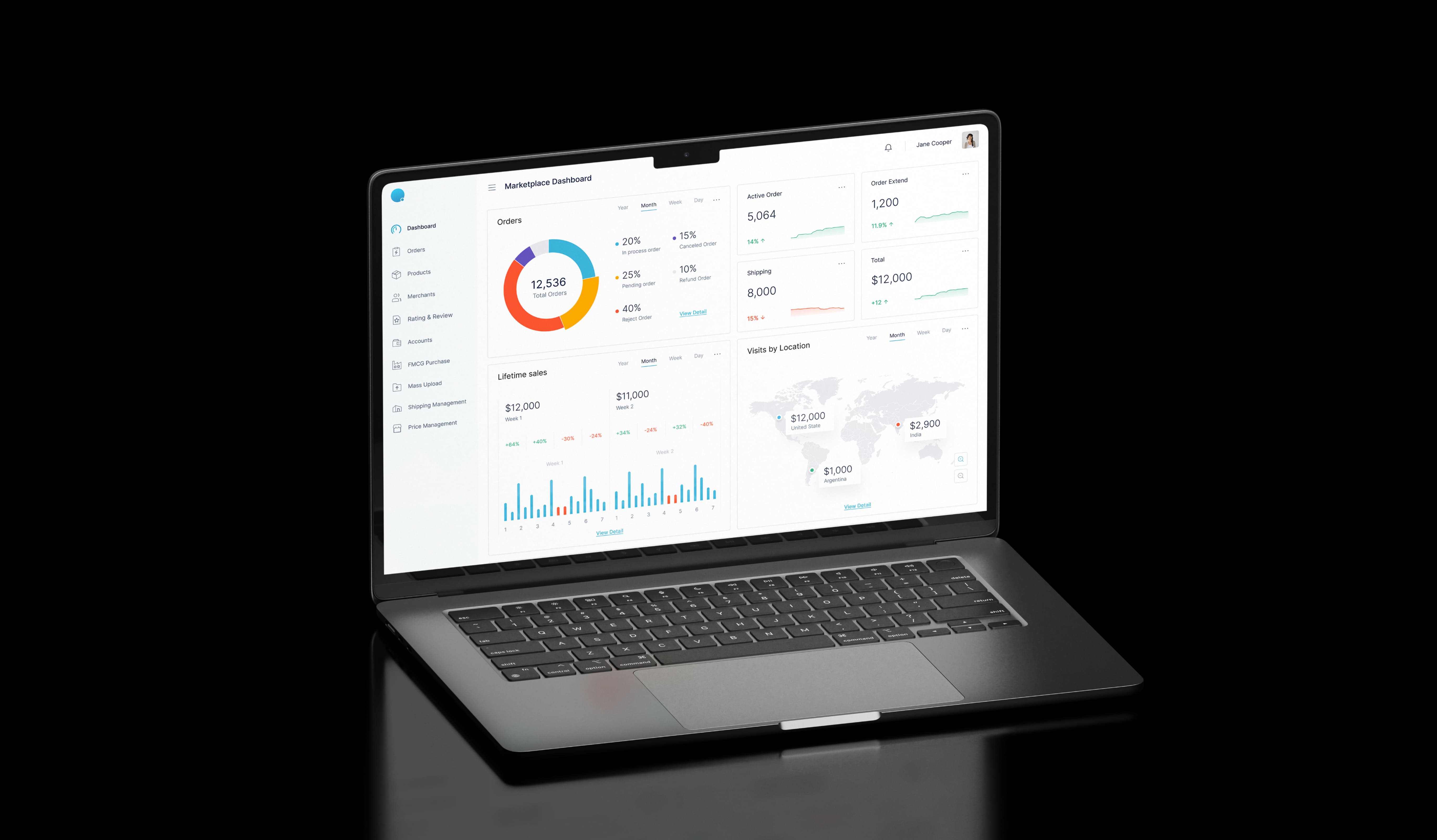
4 . Scalable Architecture:
We got all cozy with the development team to create a design that could scale without a hitch. This of course means designing a scalable architecture that could handle increasing user volumes and data loads. You know, the fun stuff. This involved optimizing performance, employing responsive design principles, and leveraging modern front-end technologies to enhance the platform's scalability. It HAD to be future-proof - and this meant sticking close to a lot of the basics, but doing it smartly.
5 . Testing and Validation:
Testing was more than a formality – it was where the real magic happened. Putting the designs through their paces with real users. Feedback flowed in, kinks were ironed out, and the design solution was sealed with a stamp of approval.
Results
500K+ downloads on the App Store
4 Star Reviews
Users in Africa, South America, Asia and Europe
With the UI/UX prowess of our team, we delivered a platform that was not just seamless and scalable but user-tailored too. This meant smoother sales, smarter payments, and happier players in the global commerce game.